Brand & Design Hub
Every design asset for Outside the 48 — the package-forwarding service
that gives Hawaii, Alaska and US-territory residents a mainland address. Logo lockups,
palette, typography, homepage directions, theme studies and page designs, all in one place.
Rebuilt 20:20 — 30 August 2026 · everything below is live on ot48.com
01 Brand assets the real, reusable files
- Logo, palette, type, all 22 photographs, both AI characters, tone of voice and positioning — every asset as a real hosted file. This is the page to give an AI brand tool.
Vector SVGs, editable and production-ready. Note: the wordmark is
live text set in Oswald, not outlined paths — so it renders correctly only where
Oswald is available. Converting to outlines is the last step before these go anywhere external.
Master lockup chosen
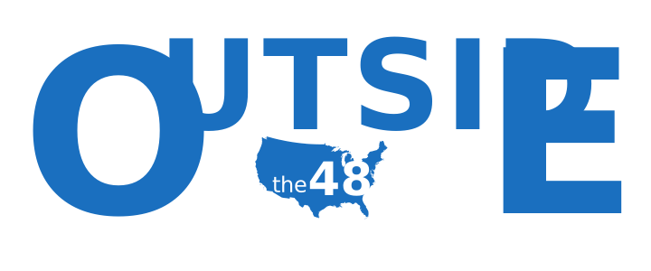
Blue on light. The full "OUTSIDE / the 48" wordmark with the 48-states silhouette. This is the primary logo.
Open SVG
Master lockup — reversed
White on dark. Same construction, for navy backgrounds and photography overlays.
Open SVG
48-states mark — blue
The map shape alone, holding "48". The icon/favicon candidate.
Open SVG
48-states mark — reversed
White map on blue field. For dark UI and app-icon use.
Open SVG
Silhouette only
Bare 48-states outline, no numerals — the raw shape for building new lockups.
Open SVG
Box lockup superseded
The earlier "small fragile box" construction. Kept for reference; the map version replaced it.
Open SVG
02 Palette & type
Pacific blue carries the brand; amber is reserved for calls-to-action and trust signals only.
Pacific Blue#1A6FBF primary
Typography
- Oswald — the logotype. Condensed grotesque, chosen for its tall O (Montserrat's round O was rejected).
- Inter — all UI and body copy across the live site.
- Open: the warmth study recommends a warm display serif for headlines. Not yet applied.
03 Homepage directions
Four takes on the front door. v4 is where the design work landed; v1 is what actually serves the public today.
v1 — Original live now
The real public homepage. Clean, text-and-colour only — no logo and no photography. This is the one the world sees.
Open
v4 — Alaska design pick
Full-bleed photographic background, logo in place, cool ice-blue treatment. The most finished direction.
Open
v4 — Hawaii design pick
Same architecture as Alaska, warm Pacific imagery. The pair are meant to be compared side by side.
Open
v3 — Hawaii boxed hero
The earlier modern-plus-imagery take, with the hero image contained in a card rather than bleeding full width.
Open
04 Logo labs the full journey, 1 → 9
Nine rounds. The arc: illustrate the words → reject the clever-but-cold box → find the
typeface → land on the 48-states silhouette that spells its own name.
Lab 9 — the map front-runner
"The shape spells its own name." The 48-states silhouette holding the numerals. Works large and shrinks into the wordmark. This is the chosen direction.
Open
Lab 8
Map-mark refinement — abstraction level and how far the silhouette can be simplified before it stops reading.
Open
Lab 7
Map exploration begins — the silhouette introduced as a container for "48".
Open
Lab 6
Further lockup geometry and mark alternatives.
Open
Lab 5
Lockup geometry measured and corrected in Oswald — kerning evened, box shrunk.
Open
Lab 4 — typefaces
The face comparison: Oswald · Fjalla One · Anton · Archivo · Saira · Barlow Condensed. Oswald won.
Open
Lab 3 — the construction
The "contain" idea: tall O and E, UTSID short on top, "the 48" boxed in the pocket beneath.
Open
Lab 2 — arrows
Directional marks: inbound arrow, reversed flow — the "we bring it home" gesture.
Open
Lab 1 — dwarfed
The first idea: "outside" rendered as small-against-large, the breakout motif.
Open
05 Theme & warmth studies
Theme switcher
Flip the whole page between Hawaii (warm), Alaska (cool ice-blue) and Plain. Backgrounds, not just heroes.
Open
Warmth benchmark study done
12 brands scored — Airbnb, Patagonia, REI, Hawaiian Airlines vs MyUS and Stackry. Verdict: OT48 scores 6/10, target 7–8. Not too warm — mis-allocated warmth. Both competitors score 3, so the warm ground is undefended.
Open
06 Eligibility checker the design comps
The "can we ship to you?" front door — built from the territories research, and the most product-like piece of the design work.
The live checker live
ZIP validation, serve/can't-serve answer, and the Oregon hub map with spokes to every market.
Open
Market photos
Hero photography for each territory — Hawaii, Alaska, Guam, Puerto Rico, Samoa.
Open
Pointer lab
11 concepts for how the map marks each destination.
Open
Design comps 1–7
The full visual progression of the checker page.
07 Every page, every version
v1 original · v2 modern flat · v3 modern + Hawaii imagery · v4 photographic + logo
Dashboard links use ?demo=ot48look — sample data, no login.
08 Onboarding pages
Welcome pack
The standalone welcome page written for Agna and the Oregon side.
Open
Guided tour
The walkthrough page introducing how OT48 works end to end.
Open
09 Where this actually stands
The gap that matters: the design work never reached the live site
- The live homepage carries no logo at all — no
<img>, no inline SVG, no favicon. The logo exists and is finished, but only appears on v4 and the eligibility checker.
- Every photograph is hotlinked from Unsplash and applied as a CSS background, not an
<img> tag. Nothing is hosted on ot48.com, so crawlers and brand-analysis tools see no imagery whatsoever.
- The logo SVGs sat local-only until 30 Aug 2026 — they had never been deployed to the server. They are now live at the links in section 01.
- The wordmark SVGs use live Oswald text, not outlined paths — they render wrong anywhere Oswald isn't loaded.
Decisions still open
- Lock the logo — confirm the Lab 9 map direction, then take the final abstraction and craft polish to Design/vector rather than hand-building it in code.
- Favicon — the map mark is the obvious answer; nothing is set at present.
- The three warmth fixes — rein in amber sprawl, lighten the hero overlay, swap headline type to a warm display serif.
- Real photography — the research is unambiguous that authentic local imagery beats stock. Agna is on Maui and can shoot it.
Settled
- Logo direction — the 48-states silhouette holding "48". The shape spells its own name.
- Logotype face — Oswald.
- Palette — Pacific blue, amber for CTAs only, deep navy grounds.
- Warmth target — 7–8 out of 10; concentrate warmth rather than reduce it.
- Positioning — Americans outside the contiguous 48. ~5.9M addressable, all USPS-domestic.